

YEON BUILDING REPOSITION
How we tied a storied past to a hopeful future
The Yeon Building is full of history. It was designed by the renowned Portland architect John Yeon and named after his father, a timber magnate… also named John Yeon. Upon completion in 1911, it was the tallest building in the Portland skyline and was added to the National Registrar of historic places in 1994. When we teamed up with Urban Renaissance Group, it was our ambition to honor and preserve the building’s historic character and stories while modernizing the interiors, both aesthetically and through the addition of amenities and conveniences expected by commercial tenants today.
CLIENT
Urban Renaissance Group
LOCATION
Portland, OR
YEAR
2020
INDUSTRY
Building Reposition
2022 Gray Design Award
Finalist
DESIGN FOR GOOD
Honorable MentioNS:
Collaboration & BATH

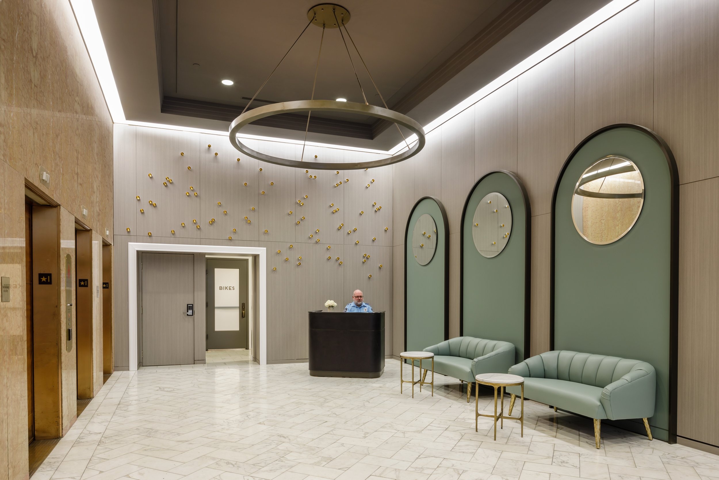
One of the most important aspects of the reposition was to bridge the historic character witH modern sensibility. In the foyer, we achieved this goal by carefully pairing original historic details, like the marble walls and mosaic floor tile with a bold modern art installation that spoke to John Yeon’s timber background.

We sprinkled nods to Yeon’s background as a timber magnate and his visionary leadership that brought the Columbia River Highway to life throughout the space.

Decades ago, lightning struck the Yeon building’s flagpole, charring the old growth Doug Fir. Thrilled to have found it, we designed a bespoke bench that adorns the community space in story and character.
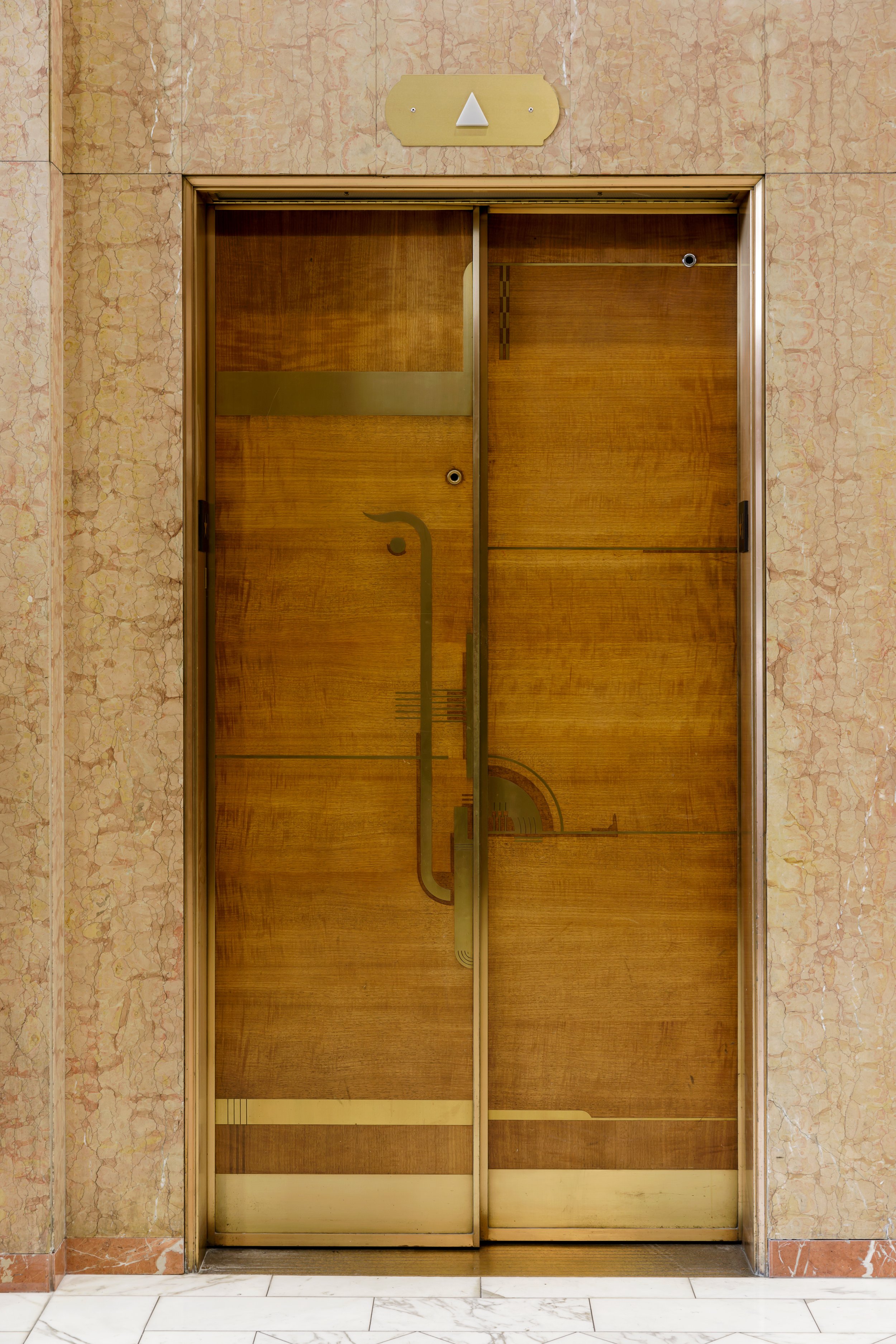
We were able to salvage the original elevator doors which were designed by Yeon’s son, the well known architect John Yeon. They infuse the space with a lively Art Deco style.


Located downtown, we ensured the building supported multiple types of transportation, including a full service bike room and shower facility.


To maximize a minimal budget, we obsessed over the details: every sculptural element was hand placed, the leather desk was selected to feel as good as it looks and the simple, yet highly impactful, arches echo the elevator’s inlay and were framed in budget aware MDF.

We even sought to innovate the HBX designed signage. While stylistically they speak to the Art Deco origins of the building, they are an innovative expression of modern demands. Each aluminum sign features multiple raised edges and textures in braille, enabling us to celebrate ADA compliance, rather than compromise.
RELATED WORK
On Point Community Credit Union - Sherwood branch

Papercut Software
Portland Headquarters

PACIFIC WEST BANK
headquarters